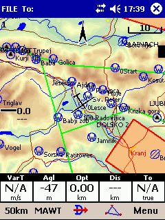
As a sailplane pilot, I was enamored with a little moving map program that ran on a Pocket PC. The pilot plugs a GPS into the Pocket PC and the program display the location of the sailplane over a sectional map. That way the pilot visualizes where they are in relation to airspace, landmarks, etc. Very cool stuff!

In 2001 I attended some classes at Air Sports Expo, the annual convention for the
Soaring Society of America. One of the classes talked about cockpit resource management and specifically the use of Pocket PCs in the cockpit. The speaker specifically mentioned moving map software and started to systematically destroy my love for this new technology.
Little did I know he was also educating me on good and bad usability...
He started talking about how aircraft radios and instruments are designed for use in the cockpit. Aircraft instruments are designed to give you the information you need in a quick glance. Radios are designed to be usable even when you aren’t looking at them. They have knobs that rotate in clicks, so that you know how many digits you cycled through when changing a frequency. Buttons have different textures to you know what you are pressing without looking. The user interfaces for these often non-software tools are largely tactile. They are designed so that the pilot can concentrate on flying the plane while keeping his head "outside of the cockpit" so he can see and avoid other aircraft, terrain and other obstacles.
The speaker then contrast this with the usability of the moving map software on the Pocket PC. The maps look great on the Pocket PC. However, a Pocket PC screen isn't always very visible in bright sunlight. If you fly in the southwest, bright sunlight is often a sailplane pilot's companion, showing it’s pretty face through clear plexiglass of our bubble cockpits.
He took the discussion a step farther, explaining how the Pocket PC relies on a touch screen. The user generally switches functions by tapping the screen with a stylus, a sort of pen without ink. The stylus exerts pressure on a very specific area on the touch screen. While it’s a very good system for landlubbers, there isn’t a sailplane pilot in the world who would want to use one while flying in a gaggle with seven other sailplanes in close proximity, all the while bumping around in the turbulence.
Developers can work around the stylus by creating "buttons", large areas of the screen that respond to touch, so Johnny Fatfingers can tap the "button" without the use of a stylus. Great! However, since there is not tactile feedback, Johnny still needs to look down to see where on the screen to tap. All the while, aa student pilot in a Schweizer 1-26 climbs 1 knot above stall speed, in the mush zone, 100 feet above him.

Aircraft instrument and radio manufacturers employ potentially life-saving designs.
While most of the software you and I create may not be life or mission critical, there is a definite lesson to be learned. Our user interfaces must be simple, uncluttered, discoverable and intuitive to use. It is important to get usability feedback from actual users, not paper personas drafted by marketeers who believe they live in the heads of the customer.
It's sad to say, but it appears as if the usability of software (and technology) in general is declining. When was the last time you could dial a seven or ten digit phone number on your mobile phone without having to look at the numbers? When was the last time you could set the clock on your VCR (do they still make those) without having to open the manual?
That's why I like the TiVo user interface. It allows you to do many things with about five inputs on a remote control. Everything is discoverable, and usability is simple and quick. Back, forward, up, down and select are the only inputs you need to survive in the TiVo world. What's more, you can record two shows and watch a third without ever having to look at the remote. That makes it easier to watch movies in the dark. The TiVo engineers knew what they were doing when they designed their user interface.
When you design your next user interface, whether its for use in a high-demand environment such as an aircraft cockpit or a simple game for the PC, think about the usability. Remember the lesson on tactile feedback and ask yourself proverbialy "Can you feel me now?"
Good.

